
I have used BoxBorder for most of my cases with Container. I haven’t tried all of them. Out of curiosity, I want to check out the existing child classes and try to make a custom message bubble for fun.
ShapeBorder Child Class
OutlinedBorder
A ShapeBorder that draws an outline with the width and color specified by [side].
BeveledRectangleBorder
CircleBorder

ContinuousRectangleBorder
RoundedRectangleBorder
StadiumBorder
InputBorder
The border is drawn relative to the input decorator's "container" which is the optionally filled area above the decorator's helper, error, and counter.
OutlineInputBorder
UnderlineInputBorder
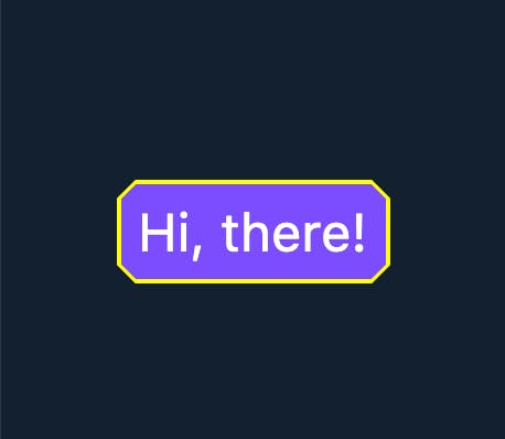
Custom A Message Bubble ShapeBorder
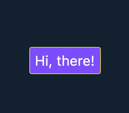
The following is going to use the OutlinedBorder to customize a message bubble shape border and eventually create a message bubble widget like this.

Here we create a MessageBorder class. The generated override methods need to be implemented.
import 'package:flutter/material.dart';

class MessageBorder extends OutlinedBorder {

  @override
  OutlinedBorder copyWith({BorderSide? side}) {
    // TODO: implement copyWith
    throw UnimplementedError();
  }

  @override
  // TODO: implement dimensions
  EdgeInsetsGeometry get dimensions => throw UnimplementedError();

  @override
  Path getInnerPath(Rect rect, {TextDirection? textDirection}) {
    // TODO: implement getInnerPath
    throw UnimplementedError();
  }

  @override
  Path getOuterPath(Rect rect, {TextDirection? textDirection}) {
    // TODO: implement getOuterPath
    throw UnimplementedError();
  }

  @override
  void paint(Canvas canvas, Rect rect, {TextDirection? textDirection}) {
    // TODO: implement paint
  }

  @override
  ShapeBorder scale(double t) {
    // TODO: implement scale
    throw UnimplementedError();
  }
}
Let’s define the constructor. BorderRadius is for later calculating inner or outer path and also for the calculation of small corner triangle.
final BorderRadius borderRadius;
final Color backgroundColor;
const MessageBorder({
  super.side = BorderSide.none,
  this.borderRadius = BorderRadius.zero,
  required this.backgroundColor,
});
When we have the constructor, we can finish implementing the copyOf and scale.
@override
MessageBorder copyWith(
    {BorderSide? side, BorderRadius? borderRadius, Color? backgroundColor}) {
  return MessageBorder(
    borderRadius: borderRadius ?? this.borderRadius,
    side: side ?? this.side,
    backgroundColor: backgroundColor ?? this.backgroundColor,
  );
}

@override
ShapeBorder scale(double t) {
  return MessageBorder(
    side: side.scale(t),
    borderRadius: borderRadius * t,
    backgroundColor: backgroundColor,
  );
}
Next, the getInnerPath and getOuterPathimplementation. It is a public function. What I can see within the ShapeDecoration class, the outer path is for interior calculation the and inner path is for image painting.
class ShapeDecoration extends Decoration {
    ...
    void _precache(Rect rect, TextDirection? textDirection) {
        ...
        if (_interiorPaint != null || _shadowCount != null)
      _outerPath = _decoration.shape.getOuterPath(rect, textDirection: textDirection);
    if (_decoration.image != null)
      _innerPath = _decoration.shape.getInnerPath(rect, textDirection: textDirection);
    }

    void _paintImage(Canvas canvas, ImageConfiguration configuration) {
    if (_decoration.image == null)
      return;
    _imagePainter ??= _decoration.image!.createPainter(onChanged);
    _imagePainter!.paint(canvas, _lastRect!, _innerPath, configuration);
  }

    void _paintInterior(Canvas canvas) {
    if (_interiorPaint != null)
      canvas.drawPath(_outerPath, _interiorPaint!);
  }
}
Suppose the effective text message display area is a rounded corner rectangle. I will simply implement it like this.
@override
Path getInnerPath(Rect rect, {TextDirection? textDirection}) {
  return Path()
    ..addRRect(borderRadius
        .resolve(textDirection)
        .toRRect(rect)
        .deflate(side.width));
}

@override
Path getOuterPath(Rect rect, {TextDirection? textDirection}) {
  return Path()..addRRect(borderRadius.resolve(textDirection).toRRect(rect));
}
For the paint part, there will be 3 cases: no border, zero border, and normal border. _paintTriangle is to paint the inner corner triangle. _paintTriangleSide is to paint the border of the corner triangle. canvas.drawDRRect is to paint the rounded corner rectangle border.
void _paintTriangle(Canvas canvas, Rect rect, int triangleVerticalDistance) {
  final Paint tranglePaint = Paint();
  tranglePaint.color = backgroundColor;
  Path path = Path();
  path.moveTo(rect.bottomRight.dx - borderRadius.bottomRight.x - 1,
      rect.bottomRight.dy);
  path.lineTo(rect.bottomRight.dx + triangleVerticalDistance,
      rect.bottomRight.dy + triangleVerticalDistance);
  path.lineTo(rect.bottomRight.dx,
      rect.bottomRight.dy - borderRadius.bottomRight.y - 1);
  path.close();
  canvas.drawPath(path, tranglePaint);
}

void _paintTriangleSide(
    Canvas canvas, Rect rect, int triangleVerticalDistance) {
  final Paint trangleSide = Paint();
  trangleSide.color = side.color;
  trangleSide.strokeWidth = side.width;
  canvas.drawLine(
    Offset(rect.bottomRight.dx - borderRadius.bottomRight.x,
        rect.bottomRight.dy - (side.width / 2)),
    Offset(rect.bottomRight.dx + triangleVerticalDistance + 1,
        rect.bottomRight.dy + triangleVerticalDistance + 1),
    trangleSide,
  );
  canvas.drawLine(
    Offset(rect.bottomRight.dx + 4, rect.bottomRight.dy + 4),
    Offset(rect.bottomRight.dx - (side.width / 2),
        rect.bottomRight.dy - borderRadius.bottomRight.y),
    trangleSide,
  );
}

@override
void paint(Canvas canvas, Rect rect, {TextDirection? textDirection}) {
  const int triangleVerticalDistance = 3;
  final Paint borderPaint = Paint()..color = side.color;
  switch (side.style) {
    case BorderStyle.none:
      _paintTriangle(canvas, rect, triangleVerticalDistance);
      break;
    case BorderStyle.solid:
      final double width = side.width;

      if (width == 0.0) {
        canvas.drawRRect(borderRadius.resolve(textDirection).toRRect(rect),
            side.toPaint());

        _paintTriangle(canvas, rect, triangleVerticalDistance);
      } else {
        final RRect outer = borderRadius.resolve(textDirection).toRRect(rect);
        final RRect inner = outer.deflate(width);
        canvas.drawDRRect(outer, inner, borderPaint);

        _paintTriangle(canvas, rect, triangleVerticalDistance);

        _paintTriangleSide(canvas, rect, triangleVerticalDistance);
      }
  }
}
After that, we can assign the dimensions of the MessageBorder. If you look into the comment, you will see this:
The widths of the sides of this border are represented as an [EdgeInsets
Actually, I still do not quite understand the meanings. Then I look into the ShapeDecoration class and I find this is the only place it using.
class ShapeDecoration extends Decoration {
    ...
    /// The inset space occupied by the [shape]'s border.
    ///
    /// This value may be misleading. See the discussion at [ShapeBorder.dimensions].
    @override
    EdgeInsetsGeometry get padding => shape.dimensions;
}
You can see the comment telling us this is border side width + the extra width want to take, in other words, inner padding.
I have set this to 8.0.
class MessageBorder extends OutlinedBorder {
    ...
    @override
    EdgeInsetsGeometry get dimensions => const EdgeInsets.all(8.0);
}
I have made a stateless widget MessageBubble with the MessageBorder.
class MessageBubble extends StatelessWidget {
  final String msg;
  const MessageBubble({super.key, required this.msg});

  @override
  Widget build(BuildContext context) {
    return Align(
      alignment: Alignment.centerRight,
      child: Padding(
        padding: const EdgeInsets.only(
          left: 32.0,
          right: 8.0,
          top: 8.0,
          bottom: 8.0,
        ),
        child: Container(
          decoration: ShapeDecoration(
            color: Colors.purpleAccent,
            shape: MessageBorder(
              borderRadius: BorderRadius.circular(8.0),
              side: const BorderSide(
                width: 1,
                color: Colors.deepPurpleAccent,
                style: BorderStyle.solid,
              ),
              backgroundColor: Colors.purpleAccent,
            ),
          ),
          child: Text(
            msg,
            style: const TextStyle(
              color: Colors.white,
              fontSize: 16.0,
            ),
          ),
        ),
      ),
    );
  }
}
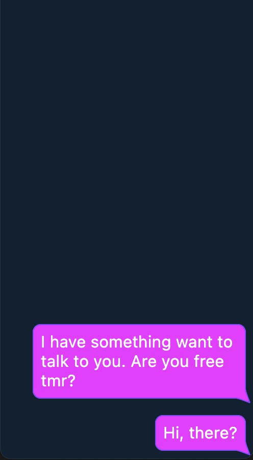
I have implemented a fake msg list view on the home page.
class HomePage extends StatelessWidget {
  const HomePage({Key? key}) : super(key: key);

  @override
  Widget build(BuildContext context) {
    return Scaffold(
      body: ListView(reverse: true, children: const [
        MessageBubble(msg: 'Hi, there!'),
        MessageBubble(
            msg: 'I have something want to talk to you. Are you free tmr?'),
      ]),
    );
  }
}
Result
complete MessageBorder class : gist